The collection
Three practices. Three answers that look nothing like each other.
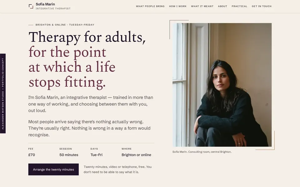
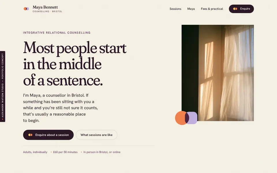
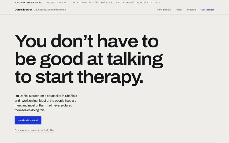
Three fictional therapy practices, each given a complete website and, published beside it, the strategic work behind it. One method, applied three times. Every conclusion sits next to the design decision it caused, so you can check the second against the first.
They are not templates to choose from. They show that understanding three different practices produces three different websites, not one house style in three colourways.
The three concept websites
What every concept has behind it
A live website, and the reasoning that produced it.
Each of the three is deployed and can be visited, page by page, on a phone if you want to see it there. Each has a Practice Clarity Blueprint published in full and free to read, in which every requirement is set against the conclusion it came from. A client receives the same kind of thinking in their Practice Fundamentals, written for their own practice and approved before the website is built.
For a real practice that order is fixed: the thinking is written down and approved before anything is designed. These three practices are fictional, and their documents were written after the concept sites, in the form a client’s is written before one. They show the method and let you check it against a finished page; they are not a record of a client engagement. The concept sites also run to more than one page, where the standard service is one complete page, with additional pages quoted separately.
Most of the people arriving on a therapist’s website are on a phone, and some of them are not calm. The phone view of each of these is not the desktop one stacked up: the hierarchy is re-decided, the type re-set, and the thing a distressed reader needs first is moved to where they will find it. All three are built to WCAG 2.2 AA.
One row, followed all the way through
The document
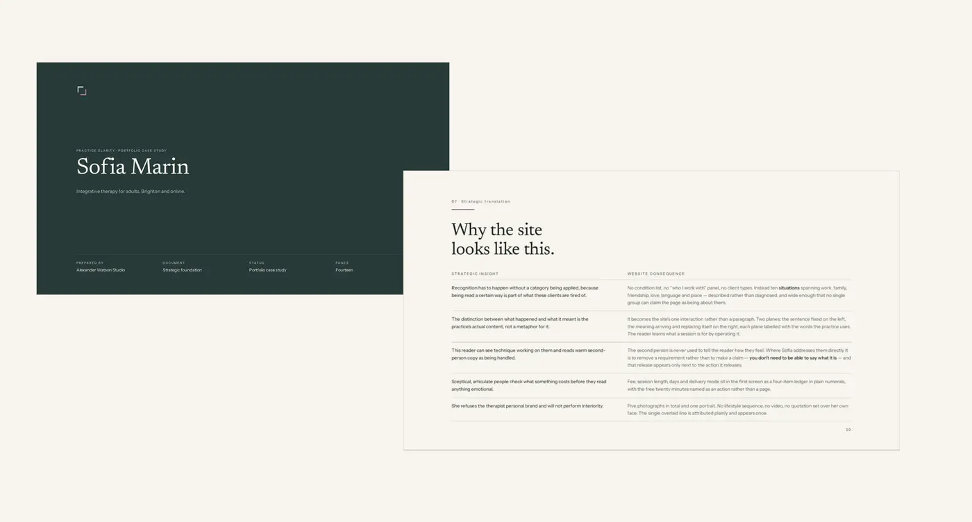
Sofia Marin · page fourteen of sixteen, “Website translation”.
One row from it
Recognition has to happen without a category being applied, because being read a certain way is part of what these clients are tired of.
The requirement set beside it: no condition list, no “who I work with” panel, no client types, but situations written without an owner instead, wide enough that no single group can claim the page.
The website it describes
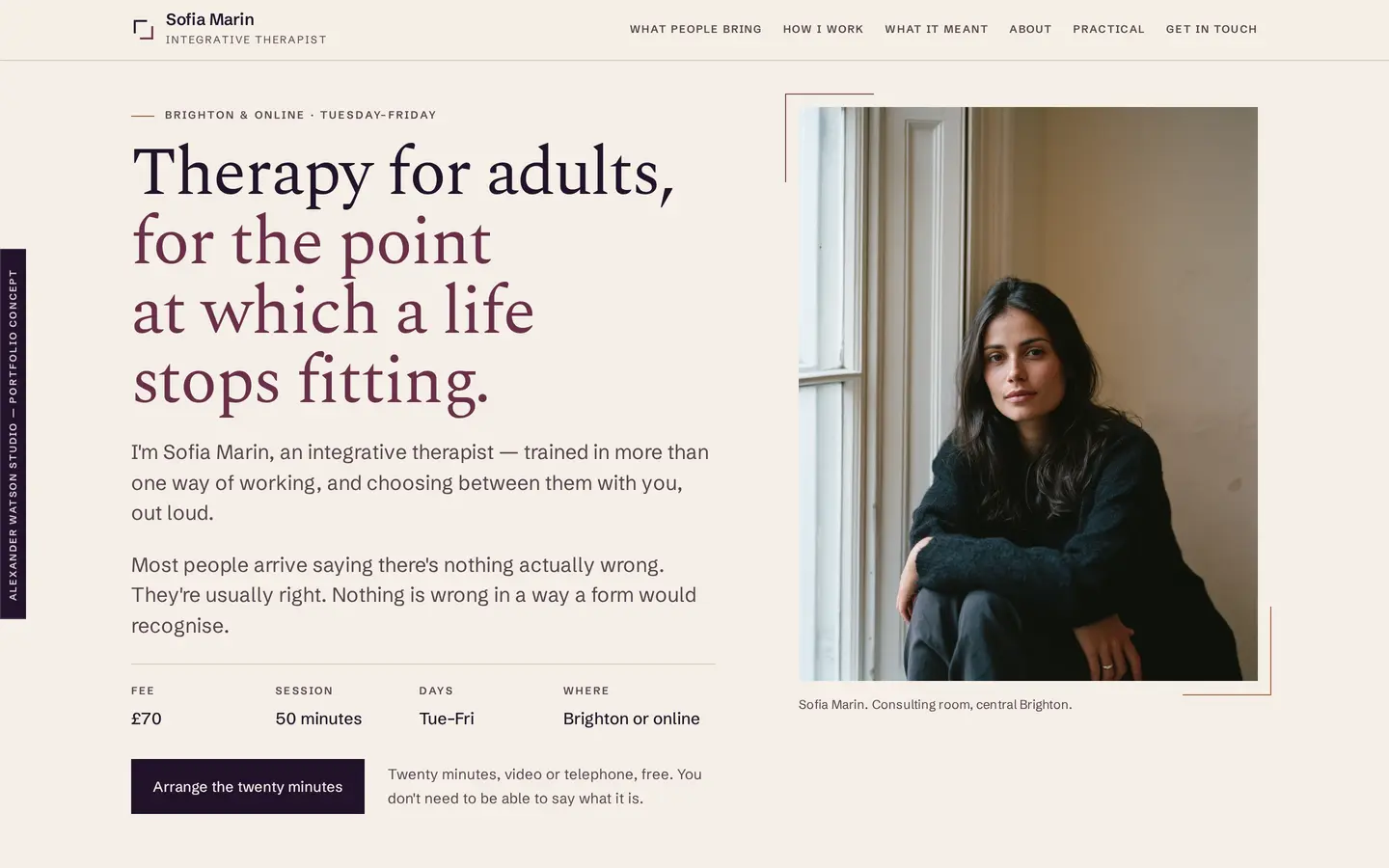
No conditions and no client types anywhere on the site. Ten situations instead, described rather than diagnosed, and the fee, session length, working days and delivery set in the first screen as plain numbers.
That is one row. Each of the three documents is built of them, and each row names the part of the site it describes, so the claim can be checked rather than taken. Read the Sofia Marin concept.
Why is it like that?
Five small decisions, and what each one came from.
None of these is a visual preference. Each is something understood about a practice, arriving somewhere different on a page, which is why the same question, asked of three practices, does not produce three versions of one website.
Colour
Why is there so little apricot on Maya Bennett’s site?
Because apricot means one thing: the moment something is met. It appears in two places and nowhere else (not on buttons, navigation, borders or a heading that needs lifting), so the only colour on the site that makes an argument can make it by itself. If a page feels flat, the answer is space, not a second accent.
Maya Bennett · Practice Clarity Blueprint, colour
The first screen
Why is the fee on the first screen of Daniel Mercer’s site?
Because the design is asked to carry no atmosphere at all, so everything the visitor is meant to feel has to arrive as information: what it costs, what happens, and what he will not do. The fee is repeated in the first screen, the navigation and a fixed bar on mobile.
Daniel Mercer · Practice Clarity Blueprint, brand direction and website translation
The order of the page
Why does Maya Bennett’s site deal with whether you are allowed to be there before it describes the counselling?
Because the test of whether something is serious enough is asked privately, and answered no. So a section of its own, straight after the first screen, removes the threshold in plain terms (including that counselling is not only for the worst fortnight of a life) on the way in, rather than as a line in an FAQ or a reassurance in the footer.
Maya Bennett · Practice Clarity Blueprint, website translation
Typography
Why is there no serif on Daniel Mercer’s site?
Because fine serifs, cream grounds, botanical motifs and soft pastels are the visual language of a category many of his visitors may not recognise themselves in, and meeting them there asks for an act of translation before a sentence has been read. The reason is not taste: one argument at the largest size, and facts set as facts in a second typeface.
Daniel Mercer · Practice Clarity Blueprint, brand direction
The enquiry form
Why does Sofia Marin’s form not ask what the problem is?
Because the first message she wants is “I’m not sure how to describe this.” So there is no field asking for the problem: a name, a way to reply, in person or online, and one optional box whose label says that exact sentence is a complete answer.
Sofia Marin · Practice Clarity Blueprint, intended client experienceEach answer is in the document published with that concept, and each can be checked on the site it describes. Every practice in the collection is fictional, designed and built by the studio.
What this means for yours
Your website will not look like any of these.
It will be worked out from your practice in the same way (Practice Clarity first, then the visual direction and the website), and it will look like whatever that practice turns out to need. If something in one of these speaks to you, say so when you write; it is useful to know, and it is not an order.
How it works, and what it costs
If it helps to know what a therapist’s homepage actually has to do before you judge one of these on it: the five things people look for.
When you are ready
Tell me about your practice.
A few lines about who you work with and where you are up to is enough. I’ll reply with what I recommend and the next step.