Professional identity
Two practices. Two identities that could not be mistaken for each other.
A professional identity is what a practice looks and sounds like wherever it appears: the name set well, the colours, the type, the words, and the things made with them. These two were produced for fictional practices with the same process a client goes through, so you can see what arrives and how much it depends on the person.
They are studio concepts, designed to briefs the studio wrote itself, not commissioned work. Nothing in them is a claim about a real practitioner, and every page of the documents says so.
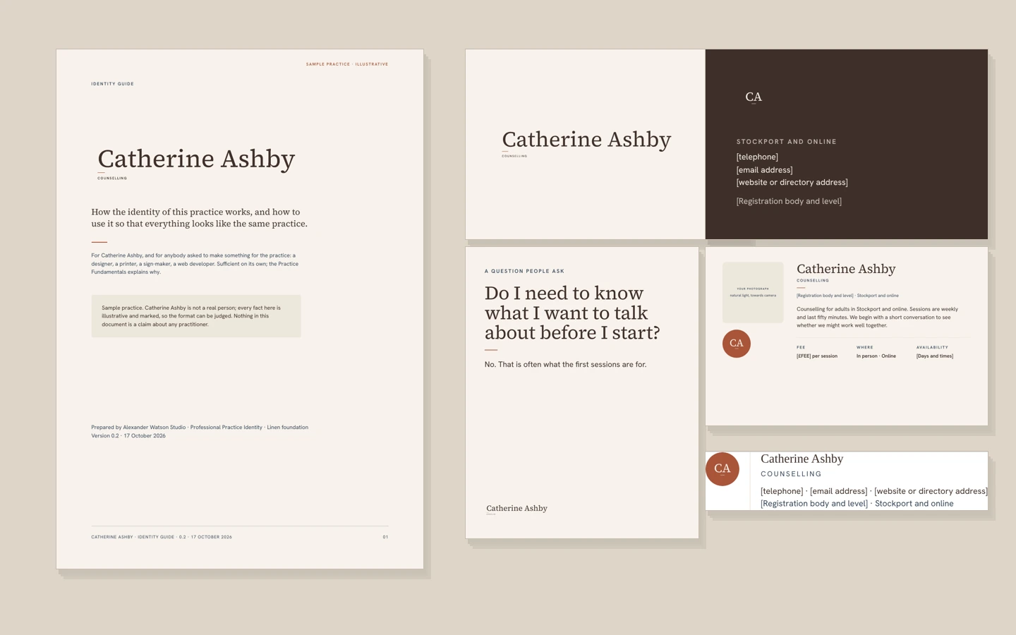
01 · Restrained and editorial
A steady, practical counsellor for adults who have been coping well for a long time.
Her clients are the person other people lean on, and they are tired of being read. So nothing in the identity announces. The name is set in a classical serif in sentence case, never capitals. The facts are in a plain grotesque, because facts should look like facts. Four paper and ink tones, one terracotta accent used in exactly one place: a short line under the name, which is the whole of the ornament. The monogram is built from the initials rather than designed beside them.
Every one of those decisions is traced to something about her practice in the Practice Fundamentals, which is the document a client reads and approves before anything is designed.
PDFs, 15 and 7 pages. They open in a new tab and are marked as samples throughout.
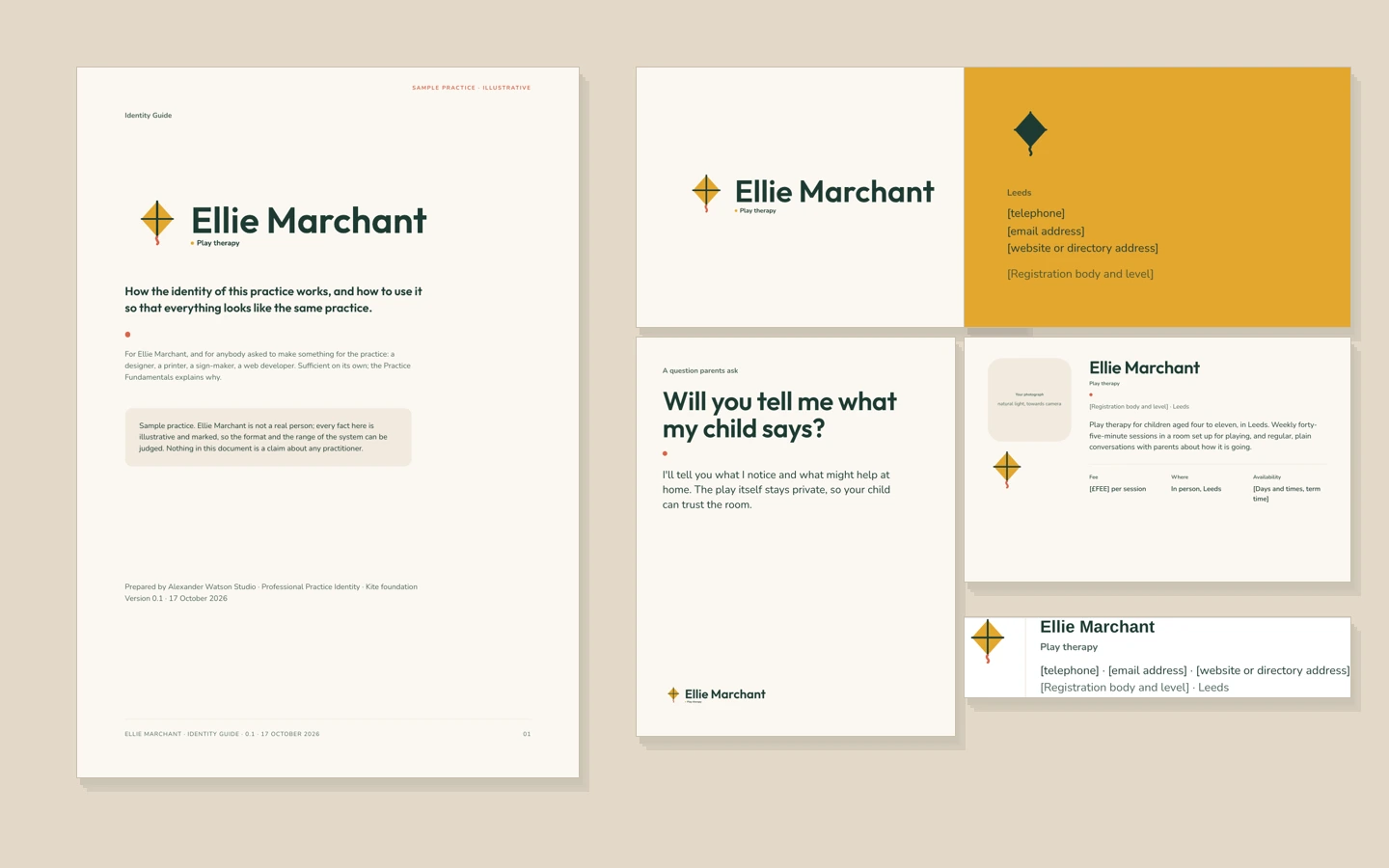
02 · Bright, clear, organised
A play therapist who takes children seriously and talks to parents like adults.
The page is read by a parent at eleven at night; the room is used by a child of six. The identity has to work for both, so it has a calm page and a bright mark. A geometric sans for the name, a rounded face for the reading, a deep green ink and two warm accents. The kite is the one picture: something made to be held and let go of. Labels are sentence case rather than capitals, corners are soft, and the practical answer always comes before the explanation.
Same process, same documents, same set of files, and almost nothing in common with the identity above, because the practices have almost nothing in common.
What a client receives
One folder, named and ordered, and yours to hand to anybody.
Both of the examples above are exactly this: nothing was added for the portfolio and nothing is missing from it. The guide is written so that a printer, a web developer or another designer can work from it without asking.
In the folder
- Your Practice Fundamentals: positioning, who it is for, values and character, voice, four key messages, and how the identity reflects you
- Your wordmark, in the configurations you need, as print-ready and screen-ready files with the type converted to outlines
- Your colours with their values and measured contrast, your typefaces with their licences, and a one-page specification for suppliers
- Six applications, ready to use: directory profile image and layout, Instagram profile and three post frames, business card artwork with bleed, A4 letterhead and agreement template (PDF and Word), email signature
- A fifteen-page Identity Guide: the decisions, how to use the identity, what not to do, and what to send a printer, designer or developer
- Photography direction, so one good photograph can be taken and used everywhere
Not in it
- A website: that is the Practice Identity & Website
- A drawn or illustrated logo commissioned from an external designer, which can be arranged and quoted
- A photographer, or arranging one
- Printing, leaflets, signage, further social templates, or a second round of changes
- Trade mark searches or registration
And the websites
Three practices that were taken all the way to a website.
Sofia Marin, Maya Bennett and Daniel Mercer each have a complete identity and a finished website built from it, with the thinking published beside them.