A case from the collection
Stillpoint
Studio Practice — fictional brief Designed by the studio to a brief it wrote itself. The practice is fictional.
Nothing is required of the reader in advance. In exchange, everything is disclosed in advance. The second half is what makes the first half believable.
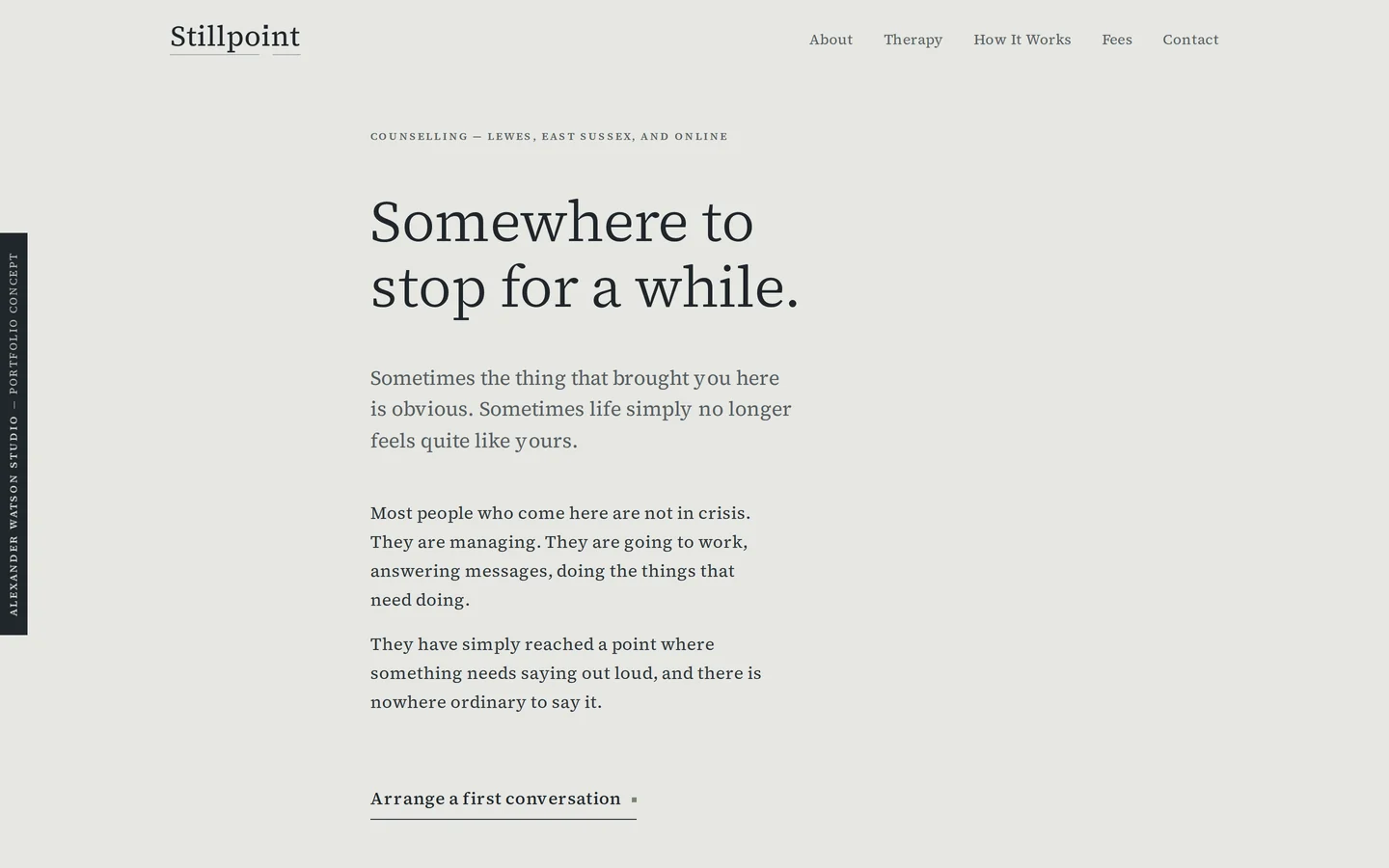
A complete concept website for a fictional counsellor in Lewes — and, published next to it, the strategic work that produced it. Every conclusion in the document sits beside the design decision it produced, so you can check the second against the first.
What was particular
The obstacle was never the difficulty. It was the entry requirement.
Michael’s clients are not in crisis. They are working, answering messages and doing what needs doing, and carrying something that has run out of anywhere to be said. What stops them getting help is rarely doubt about whether therapy works, and it is not usually the fee. It is a suspicion that the price of admission is becoming a different sort of person — one with a diagnosis, a vocabulary, a narrative, and a feeling ready on request.
So the practice removes that requirement, and then has to pay for the removal. Because the site asks nothing of the reader emotionally, vagueness about anything practical would reimpose the same demand in disguise: it would make them enquire, explain and ask. That reciprocal trade — nothing required in advance, everything disclosed in advance — is the whole strategy, and it is why a site this quiet is also the most concrete in the portfolio about fees, days, stairs and cancellation terms.
Thinking, then design
Quiet is the conclusion here, not the starting point.
A restrained website is easy to mistake for an unfinished one, so each restraint below is given with the practice insight it came from and the thing on the page you can check it against. Open the site in one tab and the document in another, and see whether the second explains the first.
- His method is subtraction, so the interface subtracts tooMichael removes whatever would make a client perform. The site removes the equivalents: one typeface across every page, and no icons, cards, testimonials, badges, pop-ups, cookie banner or analytics. What is left is type, rules and five photographs. The restraint is not a taste preference — it is the same decision as not filling the silence.
- He is credentialled and refuses to stage it, so emphasis is carried by scale aloneNothing anywhere is bold, coloured or capitalised for emphasis; display type simply runs to 60px. One calm voice, saying something large. An earlier draft held the whole site to near-uniform small type, which read as diffidence rather than restraint — that was the one thing the document changed about the site rather than about itself.
- He will not tell anyone how their grief should feel, so colour issues no instructionInk, fog, paper and stone, and a single rust accent that appears only on links, hover, focus and the dot of the wordmark’s second i. Colour is reserved for things you can do and never used for mood.
- These readers are wary of being depicted, so nobody is depictedNo people anywhere, and no portrait of Michael. Four landscapes on the whole site — an estuary, a sky, low water, reeds in mist — and one plaster wall standing in for the consulting room, captioned with a fact about the building’s age rather than staged as an interior.
- Atmosphere is for the pages about experience, so the rest have noneHome, About, Loss & Bereavement and Life Changes carry one photograph each. Therapy, If therapy is new, How it works, Fees, Contact and Privacy carry none at all. The rule is visible enough to read as a decision rather than an omission.
- The reader has been deliberating for years, so the page declines to chaseWhole bands carry a single sentence at display size over a hairline rule whose one mark sits at a golden section. The page refuses the commercial instinct to fill every viewport with persuasion, and lets someone stop mid-page.
- Restraint has to be paid for, so the practical facts are never more than one screen awayThe four irreducible facts — 55 minutes weekly, £70 with a small number of places at £45, Lewes Tuesday to Thursday and online Monday and Friday, and a free 20-minute first conversation — sit in the footer of every page. The atmosphere is allowed to be quiet because none of the facts are.
- The largest barrier is unfamiliarity, so the objection gets its own routeOne of the three homepage routes is not a circumstance at all but an objection: If therapy is unfamiliar. It is addressed to anyone who has never had therapy, and Michael’s note that more than half his clients are men sits inside it as the evidence for why it exists, rather than being the door you have to walk through to reach the answers.
Read it
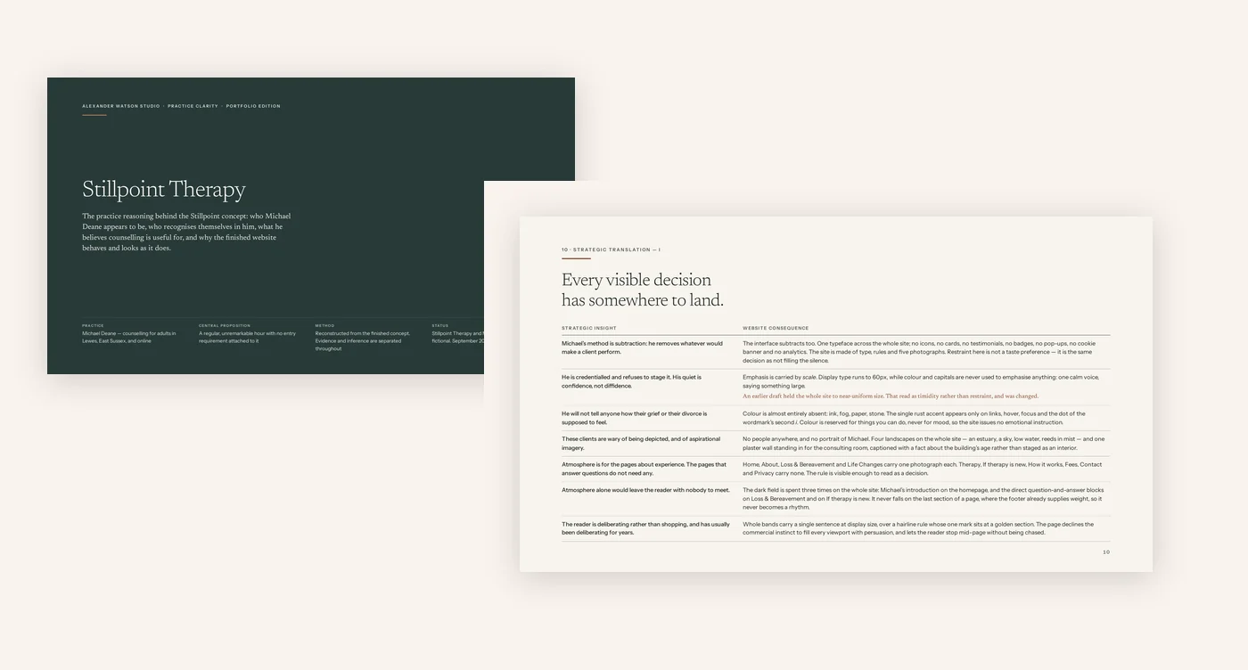
The thinking, in full.
Free to read, and unusually strict about its own evidence: thirty quotations are set verbatim and attributed to the page they appear on, every conclusion drawn on top of them carries an inference mark, and each row of the two translation tables was checked against the finished build. Where a row and the site disagreed, the site changed and the closing page says so. It is a portfolio case study rather than the written Practice Direction a commissioned practice receives.
PDF, 13 pages, about 145 KB. It opens in a new tab.
What is and is not being shown
Michael Deane is not a real counsellor.
Michael Deane is a fictional practitioner created by Alexander Watson Studio to demonstrate a website direction. No counselling service is offered. The practice, the room, the fee and the availability are invented for the concept, and there are no testimonials and no outcomes, because inventing them would be dishonest rather than decorative.
No real professional body is named or claimed and no membership number exists. No street address is published, because there is nothing at one: the room is described as a second floor in central Lewes and nothing more precise. The telephone number is from the range reserved for drama and the email address uses the reserved .example domain, and neither is a link, so nothing can be sent to either.
The concept site carries a fixed attribution tab at the left edge of every screen and the full disclosure in every footer. Its enquiry form has no destination: submission is cancelled in script, and with scripting disabled its dialog method means no submission happens at all. Every page is served noindex, there is no sitemap, and the structured data describes a portfolio concept rather than a healthcare provider.
The emergency and helpline numbers on the concept site are real and correct, because a fictional practice is a poor reason to publish a wrong helpline number.
Where to next
The other five are nothing like this one.
Stillpoint is one of the six cases in the collection. The others were built for practices with different problems and arrive at different answers, which is the whole of what the collection is claiming.