Clear structure
Visitors should quickly understand who you are, who you help and what to do next.
Website Design
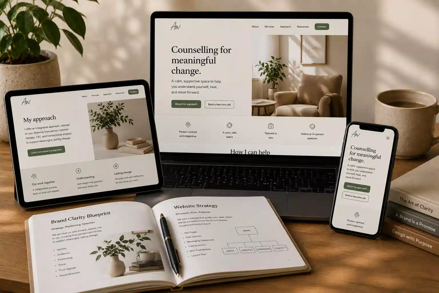
A therapy website should help the right people understand who you are, how you work and whether they feel safe enough to get in touch.
01
I do not begin by choosing a template and fitting your practice into it.
I begin with your message: who you help, what clients need to understand, and how the website should feel before someone reaches out.
02
Not more effects, more pages or more noise. Usually, the strongest websites are clear, calm and easy to trust.
Visitors should quickly understand who you are, who you help and what to do next.
Your website should sound like a real person, not generic therapy language.
Good spacing, readable text and thoughtful imagery help the site feel easier to stay with.
Qualifications, memberships, fees, location and contact details should be easy to find.
Potential clients should not have to work hard to understand how to contact you.
Your website, directory profile and wider online presence should all tell the same story.
03
Counselling Directory, Google, referrals, blog articles and your website should support each other. The aim is not just to have a nicer site, but a clearer system that helps the right people find and understand your practice.
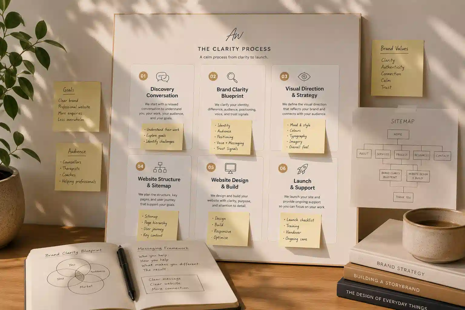
04
The website is built from the Practice Clarity work, so every page, section and design choice has a reason.
A clear page plan that helps visitors move from first impression to confident next step.
Layout, typography, image direction and visual rhythm shaped around your practice.
A responsive website with contact routes, essential SEO structure and launch support.
05
Different practices need different first impressions. These examples show how the same clarity-led approach can create different directions.
Website Design
Start with clarity, then build a website where the words, structure and visual direction all have a reason.
Start with clarity